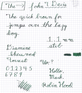
Conklin Crescent 1.1 mm Factory Stub Faux-Flex Writing Sample

Conklin Crescent 1.1 mm factory stub faux-flex sample

Conklin Crescent 1.1 mm factory stub faux-flex sample. Let me stress that I’m not so egotistical that I think people need to spell my name with a “the;” that just sort of happened that way.

Confession time: I’ve never been entirely thrilled with how my handwriting looks with a stub nib. Most people love them for the line variation–and I certainly love looking at other people’s gorgeous writing samples using stubs–but unless I’m doing outright horizontal and vertical strokes, I’ve always felt like I’m not accomplishing much more than I would with a bold/double bold regular nib. I’ve always wondered if it was because I was left handed or just because I was doing something wrong, but suffice it to say I’ve been quietly experimenting for a while with my Pendleton Point to try to get better results.

After watching hours of Stephen Brown‘s fountain pen videos (most all of which include examples of his amazing handwriting and nib flexing technique), I decided to try to emulate the way he did his capital “H.” It’s super classy and a lot nicer than the way I’ve done mine for almost 20 years, and as a bonus can be done without lifting the pen from the paper, which makes for a nicer looking result overall.

(That is to say, the way I’ve been making my H’s up to now has been inconsistent, and, well, hideous.)

You can see my attempt at Mr Brown’s H in the sample to the right–among other things.

It’s often said that you make your most interesting discoveries while you’re looking for something else. After staring at Mr Brown’s for a while, I realized the only way to do it with a stub nib would be the following. My apologies if this is a bit muddled. I had some trouble putting in words exactly what I was doing.

  1. On the initial downstroke, Angle the nib fully perpendicular to the top edge of the paper on the downstroke (that is, the nib tip should point straight at the paper’s top edge at all times) to get the widest line;
  2. Without lifting the pen from the paper or stopping, move through any cross-stroke with nib shifted to position (1), and then, without stopping, quickly rotate my grip on the pen on the upstroke so that I’m writing on the edge of the stub nib, thus getting a much thinner line;
  3. Without stopping, at the peak of an upstroke rotate the pen back to position (1) for the next downstroke or cross-stroke; and
  4. Repeat.

(The easiest way to figure out if you’re doing this right is to attempt a series of interconnected lower-case L’s. If they look like they were made with a flex nib, you’ve got it.)

Once I’d pulled off an H doing this, I noticed the line variation was extreme enough that it looked like flexible nib writing. That got me interested enough to keep practicing, eventually resulting in the writing sample to the right. Of course, I went through 3-4 sheets to get the technique down to something that looked like that. I’m extremely pleased with the results you get using the pen this way, though there are some caveats.

  1. Occasionally, you’ll need to lift the pen from the paper to get the thinnest possible line/cleanest line going forward. I found this necessary on m’s and n’s after each downstroke, for example.
  2. You’ve got to be very careful not to press down on the nib during the upstroke, when the nib is effectively on its side. This seems like a great way to misalign the tines if you screw up. Seriously, if someone is reading this and thinks I’m doing something horribly stupid to my pen, please let me know in the comments.
  3. You’ve got to maintain a pretty good speed when you do this. Move too slow and not only will the writing look shaky (since you’re writing with only part of the nib), but you’re likely to run out of ink on long upstrokes, since the nib isn’t in full contact and thus the capillary action keeping the nib wet is momentarily stopped. You’re just writing with whatever you had on the nib when the upstroke started. I think. I’m not entirely sure that’s what’s happening, but I do know you’ll run out of ink if you move too slow.
  4. Since the line variation depends on how much you rotate the pen, it takes some practice to consistently rotate the nib every time. If you look close at the sample above, you’ll surely notice some inconsistency.
  5. All these instructions are based on left-handed writing. If you’re right handed you might have to tweak it a bit. I’m not sure. I can’t write with my right hand at all, so I can’t really experiment.

I tried this with a 0.9 mm Pendleton Point Stub Italic as well (actually the pen I was using when I figured out how to do this). The stub-italic has sharper corners than a regular stub (for crisper writing). That means the edges are sharper and while you can thus get even thinner lines on the upstroke, it’s also harder to do–there’s less residual ink on the nib when you rotate it, and the sharp edge is more likely to scratch the paper as opposed to, y’know, writing.

So my recommendation if you want to try this would be to use a regular no-frills stub, the bigger the better–but not so big you can’t control it. A bigger stub will put more ink in play, which means you’ll have more to work with on the upstroke, and it’ll be more forgiving than an italic/quasi-italic nib about being rotated.

Thoughts? Has anyone else tried this?

Wahl-Eversharp Skyliner 50 Writing Sample

W-E Skyliner 50 Writing Sample

First writing sample using a semi-flex nib. The large signature and ink name are examples of flexed writing.

So…I’m back.

Seriously, the fact that I’m posting more than once in a single month, as opposed to once every 4-6 months, should seriously impress you, my vast audience of search engine robots and people trying to buy blotting paper, who read these entries.

For those familiar with my old blog and uncomfortable with change, I’m sure normal, glacially slow service will resume shortly. 😉

Moving on…I’m pretty wiped right now since I just got back from the gym a little while ago, so I don’t really have too much to say. I’ll let the writing sample speak for itself. I want to come back later and add some more in depth thoughts about this pen–it’s only the second pen in my collection I’d give a 5 out of 5 to–but any in depth review I tried to write right at this moment wouldn’t quite be up to par.

I do have a few notes/first impressions:

This is my first flex nib of any type. Seeing how well it performed in the initial video review put up by Earthdawn on FPN pretty much sold me on the pen. That said, when you first start flexing, it can be a bit nerve-wracking. We’re taught to be careful not to spring the nib, and that fountain pen nibs don’t need pressure. You’ve got to unlearn that a bit. My advice would be to watch a video of this nib in action, so you know what it’s supposed to do, and then ease into it. The nib will feel a bit stiff out of the box, and require more pressure, but after just one writing session it gets a lot more limber. Go slow, have fun, and enjoy the shading.

I’m going to keep practicing with it as much as I can so I’ll be ready when W-E starts selling the vintage-style gold-alloy flex that has previously been mentioned on FPN.

The build quality of the pen is amazing. The blind cap and the feed/nib unit itself are the only removable parts. The body is a single piece. It feels incredibly solid in the hand, which is unusual in my experience for such lightweight pens. This also makes taking it apart to clean, or swapping out one nib for another, incredibly easy. I’m getting to the stage in my fountain pen collecting where I’m increasingly prioritizing ease of maintenance  so I’m really enjoying this aspect of the pen.

Body size tracks almost identical to the Pilot Custom 823; the W-E is a little skinnier, but not very much. If the body size of something like a Custom 823 works for you, the Skyliner will work just as well. The grip is similarly well thought out and executed. No chromed grips here.

This isn’t something obvious in the video, and it took me pleasantly by surprise: the blind cap that unscrews from the back to uncover the fill knob is not just a piece of plastic. The inside has a sleeve of what I’m guessing is stainless steel, which has the screw threads on it. The metal not only looks really classy, but also protects the blind cap from damage during use and probably makes the action smoother than plastic would be.

(That said, I’m guessing the metal threads on the blindcap mean using this pen as an eyedropper is out of the question. I’ll have to get some guidance on this. It would be a great pen for an ED if you could use it that way: the body is huge and hollow.)

This is the first steel nib I’ve written with that’s plated with rhodium. It’s quite smooth, and very nice to look at. It’s easily in the top 5 nibs I’ve got, right up there with a couple of Pilot gold nibs, which are my benchmark for consistency and smoothness.

This is going to be on my daily carry short list for full sized pens for the foreseeable future, right there with the Custom 823.

(Re: “full sized” –for comparison, my Jinhao Dreadnaught is what I would consider an “oversize” pen suitable for use as an emergency personal defense weapon and or boat anchor.)

The packaging and customer service–all the fit and finish that makes a pen experience beyond just the pen itself–are all full throttle excellent. Whether it’s the Skyliner or any other of the new W-Es that catch your eye, this is a pen line you definitely want to get in on.

(And for those reading this and thinking I’m always going to end my pen mini-reviews with go-buy-it recommendations  I can promise you that won’t be the case. My Lamy Studio LE and I are still having a spat…)

Now I want to see Kermit the Frog teaching people about cellular networking standards. My mind does work a bit oddly, yes. Why do you ask?

Now I want to see Kermit the Frog teaching people about cellular networking standards.
My mind does work a bit oddly, yes. Why do you ask?

Edit 1 (4/13/2013, 9:16 PM): Did a writing sample earlier trying to showcase the semi-flex nib. Seeing as I’ve never used one before, I think it came out pretty amazing. I love playing with this nib. (Though you can probably tell where I started running out of ideas for things to write. When you start writing down all the cellular networking acronyms you know, it’s probably time to step away from the writing sample for a bit.)

Jinhao Dreadnaught 159 Pendleton Point Writing Sample

Jinhao Dreadnaught 159 Pendleton Point Writing Sample Hello. So, Posterous is going the way of 8 track tapes, and will be offline by the end of April. I’ll slowly but surely be moving my posts over to this blog, and re-categorizing and re-tagging  them while I’m at it. The organization on my last blog was horrid.

And making sure I have great organization is surely the most important thing for my blogging. It’s not like I need to post more than once every three months or anything. -_-

Anyhow, I got a Jinhao 159 Black Dreadnaught from HisNibs.com as a Christmas gift, and really loved the size and shape and color–everything about the way it looks is pure class. The grip is huge and comfortable and not slick at all, and in an emergency I think I could use the body as a club. That said, I was disappointed to have such a great looking pen give me serious hard-starting and skipping issues. I was storing it upside down to deal with the hard starting and still having problems, and never could figure out what was causing the skipping.

I met Pendleton Brown at the 2012 Dallas Pen Show back in September and had a great time talking with him as he worked on a couple of my pens. I was very impressed by the output of his custom-ground stub-italics, and I decided my misbehaving 159 would be a great pen to try one out on.

I got the pen back this week, and it has been amazing. It’s been quite a while (since I first bought my Pilot Custom 823, actually) that I’ve consciously been going out of my way to find an excuse to write with a pen, but it’s just so much fun to use. The misbehavior is gone, and the new line it puts down is wet and full of character. The shading I’m getting from it now is also excellent. Before regrinding, the line was so thick and wet (when it wrote) that there wasn’t very much shading at all, if any. I couldn’t be happier, or recommend Pendleton higher: his customer service is excellent and he’s always a joy to talk to.

HisNibs rates the 159 as a western Medium, trending towards bold (it was certainly the widest non-stub nib I had before it went in for surgery). After re-grinding, Pendleton said the line is about 0.9mm, which is about as wide as I would want a stub to be for everyday use. My handwriting tends to be smaller because of my severe tunnel vision (and in spite of my large hands and preference for big pens), and 0.9mm is about my maximum size for normal writing. (I have a 1.1mm stub Conklin Crescent and it sadly doesn’t get as much use as it should because the line width is so big.) I’d still switch to a Japanese F or a Euro F for margin notes or something similar, but the 159 at 0.9mm is great for normal writing.

The only thing that’s holding me back from giving the pen a full 5/5 is, well, me. I’m not entirely sure how to hold a stub-italic to get the best line variation, and I know sometimes I’m not holding it right at all (I can tell as there is no/little line variation in a test cross-hatch). I’m trying to train myself to write with the nib contact-point parallel to the paper, but it’s harder than I thought it would be. I’m left handed and have a tenancy to let my grip form a claw around the pen, so it’s taking some conscious effort.

If I had to come up with one other critique, I could only say that it’s too bad the regrind didn’t make my handwriting magically look like Pendleton’s, which is always incredible. Observe what he can do with this same pen.

I’m starting to realize writing faster may have a lot to do with getting the best performance out of this kind of nib.

Look at Pendleton's writing sample. Now back to mine. Now back to his. Now back to mine. Obviously, mine isn't his. I need to work on that.

Look at Pendleton’s writing sample. Now back to mine. Now back to his. Now back to mine. Obviously, mine isn’t his. I’ve got some practicing to do.

As to my writing sample, it’s my usual form. I didn’t do any smear tests or anything else related to the ink, and I can’t promise my scanner is giving an accurate color reproduction. In my writing samples, I’m more concerned with how the pen performs.

I couldn’t be happier with this nib. This pen is now one of my regulars, second only to my Pilot Custom 823 Fine, and much more likely to leave the house with me when I’m not wearing a shirt pocket. I’m much more comfortable carrying it in my pants. It’s also the nib I used to make the digitized copy of my signature I’m currently using to sign documents.

Now, I just have to learn to make it sing.